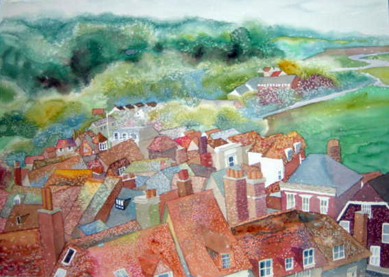
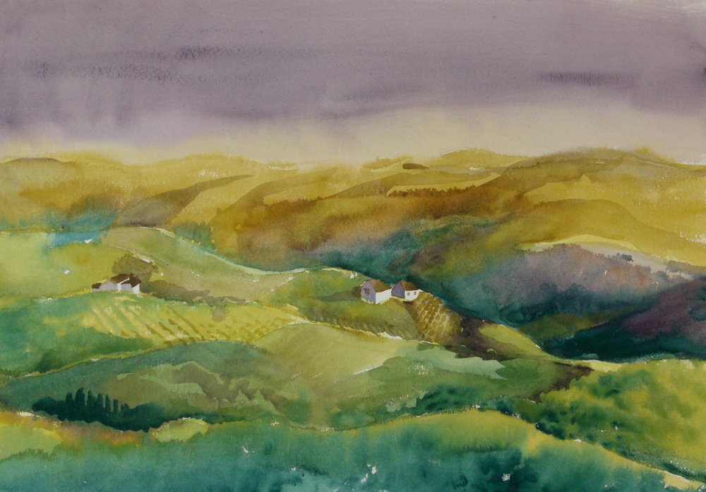
Wonderful quote from Ira Glass

Begin to Draw 


“Nobody tells this to people who are beginners, I wish someone told me. All of us who do creative work, we get into it because we have good taste. But there is this gap. For the first couple years you make stuff, it’s just not that good. It’s trying to be good, it has potential, but it’s not. But your taste, the thing that got you into the game, is still killer. And your taste is why your work disappoints you.

A lot of people never get past this phase, they quit. Most people I know who do interesting, creative work went through years of this. We know our work doesn’t have this special thing that we want it to have. We all go through this. And if you are just starting out or you are still in this phase, you have to know it’s normal and the most important thing you can do is a lot of work.

Put yourself on a deadline so that every week you will finish at least one piece. It is only by going through a volume of work that you will close the gap, and your work will be as good as your ambitions. And I took longer to figure out how to do this than anyone I’ve ever met. It’s going to take awhile. It’s normal to take awhile. You’ve just go to fight your way through.”


Ira Glass
Sketchbook Ideas

Sketchbook Ideas - I’m always looking for inspiration to sketch while at the Dr.’s office, at home, watching TV, or anywhere. I found a list online by another artist, and have elaborated on it with some ideas of my own. The best way to get better at drawing is to simply do it! Have fun!

1.    Pair of socks

2.    Object that is moving

3.    Cubist portrait

4.    View from a window

5.    Candle in the dark

6.    Corkscrew

7.    3 Objects from the refrigerator

8.    Box of popcorn

9.    Set of keys

10.  Hand holding an object

11.  Your feet

12.  Yourself as a cartoon

13.  Pattern cloth on a table

14.  Wine corks

15.  Face in a profile

16.  Candlestick

17.  Fictional woodland creature

18.  Close-up of grass

19.  Object 3 times in diff. lighting

20.  Pile of jewelry

21.  Close-up of hair

22.  Doorknob

23.  Bird in flight

24.  Video game control

25.  Pile of yarn

26.  Stack of plates

27.  Tromp l’oeil image

28.  Someone falling

29.  Hung drapery

30.  Water sprinkler

31.  Calm reflective water

32.  Ocean waves

33.  Pile of rocks

34.  Cup of pencils

35.  Hard candy

36.  Fruit sliced open

37.  Vegetable sliced open

38.  Reel mower

39.  Pine cone

40.  Sea shell

41.  Banana peel

42.  Old cabin

43.  Old factory

44.  Flowers in a vase

45.  Simple forms

46.  Farm equipment

47.  Sailboat

48.  People in a line

49.  Teacup and saucer

50.  Cutlery

51.  Bowl of peanuts

52.  Bowl of nails

53.  Bushes or shrubs

54.  Several eggs

55.  Favorite insect

56.  Flower up close

57.  Thumb drive

58.  Exotic fish

59.  Scene from history

60.  Feather

61.  Any detailed machine

62.  Inside a clock or watch

63.  Skull

64.  Apple or avocado

65.  Portrait  of a person of color

66.  Water from a faucet

67.  Creek in the woods

68.  Old shoes

69.  Glass of water

70.  Hand

71.  Scene in a restaurant

72.  Stack of books

73.  View out a window

74.  Your art supplies

75.  Wine bottles

76.  Children’s toys

77.  Person laying down

78.  Person sitting in a chair

79.  Design a typeface

80.  Different types of trees

81.  Objects in a pocket

82.  Game pieces

83.  Caricature of yourself

84.  Pet

85.  Crumpled paper

86.  Old chair

87.  Old person’s face

88.  Stapler

89.  Old radio

90.  Old car

91.  Old camera

92.  Open book

93.  Anything metal

94.  Hammer and screwdriver

95.  Tree bark

96.  Your feet on a stool

97.  Junk drawer contents

98.  Bowl of dried rotini

99.  Fire truck

100.                Buttons

101.                Spools of thread

102.                Nail polish bottles

103.                Hairbrush and comb

104.                Salt and pepper shakers

105.                Bicycle or tricycle

106.                Cowboy boots

107.                Garden furniture

108.                DVD’s

Things I Learned in Workshops, Lesson 1

* Dabbing is not healthy

* Don't paint the inside of what's happening; paint the outside of what's happening. The character of an object is carried by the outside edge, not the inside.

* The area of dominance is the talking area. Bring the area of dominance up - the rest of the area comes up to support it.

* Use the biggest brush you can for as long as you can.

* When painting flowers, put the opposite color first.

* To catch the viewers eye at a distance you need good values and shapes. Then carry the eye through the painting, bringing the eye to the area of dominance, and hold it there as long as possible.

* We have been programmed by nature as to what is a landscape.

* In landscapes, values are lightest at the horizon; the sky becomes more intense in value as it gets higher in the painting, and the foreground gets more intense in value as it gets closer to you.

* When painting water, establish the water, then add the ripples.

* When painting fog, color range is closer in value.

* Most of the time, reflections are darker than the source. An exception is black objects; it can't be darker so the reflection is lighter

* When choosing between reality and design, ALWAYS PICK DESIGN!

* Parallel lines can be a discomfort

* Start with the easiest, biggest, simplest.

* When doing a thumbnail sketch, think three values; dark, medium, and light. Use the point and side of the pencil.

* Color lies in the mid-tones, not in the darks and lights.

* The nice thing about damp paper is the edges combine together.

* Most bad paintings are a violation of an elementary painting principle.

* When you don't know what to do, break the line.

* Good colors for caucasian skin: yellow ochre, scarlet lake, cobalt blue, olive green, cobalt violet.

* A cast shadow is always a darker shade of whatever it is cast upon, not grey.

* Overlap color of objects into surrounding shapes.

* When you have a soft edge underneath and a hard edge on top, it tends to look painterly or loose.

* The viewers eye can finish a shape; you don't need to finish it.

* If you have two objects of the same value, connect them.

* Photos are a good reference, but photos lie.

What is Art For?

What is Art For?

1. To record the beauty around us

2. To reassure us of the normality of pain. If we see pain or sadness is art, it lets us know we are not alone in our feelings.

3. To fight the false commercialism of modern society. With a world that is so caught up in labels and lack of individuality (there's a Starbucks on every corner!), art reminds us that we are unique; as unique as every piece of art. I give my students a project and I get 15 different results. This is what I'm talking about! 

4. To show qualities we are looking for in ourselves or our lives. Art reflects values and standards, or even lack of them.  we can see this in the artwork of others, allowing us to aspire to greatness or try to improve ourselves.

5. To help us appreciate the world around us

6. To return glamour to its rightful place. Glamour does not belong to anyone who ever had their face in "US", or "People" magazines. It belongs to art. The exception might be evening gowns by McQueen, which are often seen on movie stars. They are art as well.

7. To offer propaganda for what really matters. Consider "Guernica" by Picasso; this painting changed the tide of politics in Spain. The list is long.

25 Tips for Painting Loose Watercolors

1. Do Value sketches

s. Simplify your subject

3. Do a fairly accurate drawing with good shapes on your paper

4.Think shapes, not objects

5.Paint from large shapes to small shapes

6. Pay attention to edges - hard, soft, lost

7. Be sure you have soft and lost edges in your painting

8. Paint quickly, but under control

9. Get in and get out

10. The first stroke is your best stroke. Fewer strokes win.

11. Use the largest brush you can for as long as you can.

12. Fewer palette colors result in fewer touches of the paper.

13. Use a spray bottle to help move the paint on the paper.

14. Paint on an angle to help color move.

15. Pick up and tilt your board for even more movement.

16. Don't worry about always doing a good painting. Remove the stress and play!

17. Don't worry about messing up.  It's a sheet of paper, and you can always paint on the back.

18. Don't render; interpret

19. Keep in mind what attracted you to the subject matter in the first place. Stick to that and downplay everything else.

20. Don't give everything the same level of attention

21. Don't try to make it happen, just let it happen. Trust the water, paper, brush, and paint.

22. don't use too many tricks and gimmicks.

23. Paint the same subject several times in a series.

24. Realize that you ave to be willing to do a lot of bad paintings before you start doing good paintings.

25. Paint, paint, paint, and have fun!

Green!

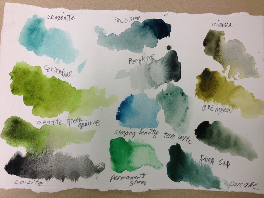
Green is not just yellow and blue; the varieties are endless thanks to the creative folks at all the paint manufacturers.  I've attached a color chart of the greens I use. My favorites are Daniel Smith Olive, Undersea, Perylene Green, and Prussian Green. Also, Windsor Newton Olive (way different from Daniel Smith!). Cascade Green is nice too, but a bit too neutral for me. The others I use as blues - Perylene, Prussian, or as yellows - olive and undersea. The nice thing is that you COULD mix these colors yourself, but now you don't have to. To ignore green is too ignore so much of nature. It is, after all, green!

More good news about paint!

I've just been to a demo by Daniel Smith, and continue to be wowed by their range and quality. While the Mission Gold paints may be vibrant, the Daniel Smith is way out in front on the color range, intensity, and selection. They also are vastly more lightfast, according to the rep. I experimented with the mineral colors; apatite green genuine, zoisite, piemontite genuine, and serpentine genuine. WOW! what amazing granulation. If you are looking for texture, this is your stuff.

I have to say, the colors are also consistent, and the customer service has been top notch.

My real go-to colors are all there with the addition of Moonglow, the most gorgeous warm purple ever, Prussian 
Green, a fabulous rich green I often use as blue, and Deep Scarlet, an amazing warm, middle range, warm, transparent (yes!) red. Of course, there's the perylenes and the quinacridones.

I'm so lucky to be able to use these colors!

By the way, according to the rep, they're #1 in Australia, and #2 in England! Look out, Winsor Newton!

Thank you Daniel Smith! www.danielsmith.com

Mission Gold Watercolors - Something new in paints!

Since before there was hair, watercolors have been a combination of pigment and gum arabic. Worked great all this time. Well, something wonderful has happened! Mijello, a division of Weber Art (great American art supplier for a long, long time), has come up with something divine. Instead of using gum arabic as a binder, they use silica. Yup, same sand that is used to make computer chips; like glass. So what do you get?? Fabulous, clear rich colors that just sing! The tubes are small but mighty. I've been using the same ones for months now, and it looks like I've hardly used them. That's how potent the pigments are. My favorite is Peacock Blue; fabulous, fabulous color; rich, deep. But all the colors are as promised. The sets come with a clear and easy explanation of the difference they provide.  I

www.mijelloart.com

www.weberart.com

Recipe for Arranging a Good Still Life

How To Arrange a Still Life

First, a little history. Back in the Rennaissance and Romantic eras of art, still lifes were used to convey the artists talent. So, there were many objects put into the paintings. Also, objects had meaning, for instance a cut open fruit meant resurrection or rebirth. Each flower or insect or nut or whatever had a meaning either religious or social. Pretty interesting! Artists would convey their versatility and knowledge through these paintings. 

The Impressionists pretty much blew all the historic aspects away, and brought a whole new meaning to still life. Their work was immediate. The fruit was on the table, and they probably were going to eat it after they painted it. To them it was like everything else; the light, texture, and personal relationship. 

Then we have the modernists; Warhol (tomato soup can), Georgia O'Keefe (flowers), Jasper Johns (manhole cover), Picasso (many!). They've put their own spin on still lifes each seeing the mundane in our world as something unique, and worthy of discussion and viewing.

Ingredients:

      Objects - Use varied objects that are somewhat related such as:

                        1. Wine bottles, grapes, pitchers, bowls, fall flowers

                        2. Watering can flowers, garden tools, vases, garden gloves

                        3. Teapot, cups, teabags, fruit, bread, doilies, books

                        4. Chopsticks, fish, bowls, sake, cherry blossoms, sculpture

5. Pick one object, and have an assortment of them: bowls, veggies, fruit, ornaments, easter eggs, nuts, geese sculptures... anything!!

Background – It should support the objects in color, subject, or mood:

  1. Old wooden panels, flags around nautical elements
  2. Lace behind antiques with a vintage shawl,  or brocade
  3. Bright colors, a hung sombrero behind Mexican objects
  4. Don’t forget to lean or hang things in the back.

Table – Have the objects sitting on an interesting surface with possibly more than one texture, such has wood and cloth, or various fabrics, books and paper laying down flat. Remember, you never have your eyes at the table level so the flat surface has to be addressed as well.

Arrange your objects so they don’t stand or sit tall to short.  Make an interesting visual line along the top of the objects. Try not to put the tallest objects on the ends; it will visually prevent the viewer's eyes from moving around the painting.

Put some things in back and some more forward so the shapes overlap. This will help the viewers eye move through the still life. Arrange the heights in a pleasing manner. If you have boxes or things that open, show some of them in an open position. Things can be tilted, leaning, opened, etc. Foods can be open or in pieces/slices.

View from front and sides, make sure it is visually pleasing. 

Have a good light source so you have interesting shadows, and created depth of form on the objects and background.

Unify with color. Don’t have one object that stands out because of its color. Ex.: if you are working in a palette of yellows and greens, a blue object is okay because you can work the blue into the green objects and vice versa, but a purple object would look out of place, and be difficult to work into the colors. Be thoughtful about the color, but don’t let it rule the arrangement.

Make the arrangement pleasing to you! It should inspire and get those creative juices going.  Solve your problems while you do the arrangement, and your hard work will make the end result just what you want.

Packing for Plein Air

Packing for Plein Aire

As a plein aire watercolor painter, I never seemed to get the results I wanted until I modified my philosophy about why I was doing it. So, why am I painting plein aire? I wanted to be outside in the beautiful weather, I wanted to capture the light and shadows through my own eyes, and I wanted to feel the spontaneity that comes from painting in the immediacy of the moment. My focus is to gather information, make accurate sketches, and capture the impression of what I am seeing. In summary, I am getting down as much information as I can in a limited period of time with simple, portable materials.

What do I take out with me? As little as possible to get the most bang for my buck. I don’t want to carry a lot of heavy, bulky supplies. I want to walk as far as I wish to get the best view. I want a variety of materials depending on what I see and how I feel. My main requirement is that it all fit in an over-the-shoulder carry bag. Here’s the list:

Basic bag – fits comfortably over my shoulder. Mine has a zippered pocket for my keys, phone, and wallet. Durable and waterproof are a bonus.

Portable stool – I have a tripod stool that folds up and is lightweight aluminum. Amazon.com has lots to choose from; type in “portable camp stool”. Golf stores have them too.

9x12 or 11x14 drawing pad (nothing bigger or it’s too bulky – make sure it fits in the bag).

9x12 or 11x14 90# watercolor pad. Canson makes a nice one. You don’t need heavy paper because you’re not going to be doing any “heavy” painting. No Strathmore!

White synthetic eraser – Mars Staetler, or any brand. They’re cheap and they do a great job on any surface. They don’t leave a pink mark like Pink Pearl, and they lift more than a kneaded eraser.

Pencils – 2H for detail, and 2B to get the darks and quick information. Anything else you like, but those two will do it. Automatic pencils are great, but the lead tends to break for me (don’t know my own strength).

Pencil sharpener – A good one is the KUM Automatic LongPoint. It has two holes; one for removing the wood, and one for sharpening

Watercolor pencils – You only need 8: warm red, cool red (dark), warm yellow or ochre, lemon yellow, dark cool blue, warm blue, purple, and a dark green (but you have to promise not to use it as a green!)

A portable watercolor kit. It’s a bit pricey, but I recommend the Windsor Newton Cotman Field kit. It comes with about a dozen half pan colors, a brush, two palettes, two water containers, a sponge, a way to hold it, and all in a space of about 2x1x4”! Talk about portable! The half pans can be replaced and upgraded easily, and some of my friends pop the unwanted colors out, and then squeeze in their colors from their tube paints and let them dry for portability. The best thing about this kit is that it closes up with little mess, and great ease. This is the most portable solution, but there are many options out there. Go with what seems the most practical for you.

Brushes – a #4 round, #8 round, and a ½” flat

Camera!

Odds and Ends – Salt, zoom finder, grey scale (I use a paint sample #780 F from Home Depot with 4 shades of grey on it), qtips, toothpicks, hand sanitizer, bottle of water (two, if you want to drink one!), a few paper towels – just tear them off and fold them up; you don’t need a whole roll, Kleenex, sunscreen, poncho, hat, and bug spray.

Colors on my Palette

Palette Colors

Yellows

Quinacridone Gold - Daniel Smith                        Earth

Nickel Azo Yellow – Daniel Smith                            Cool yellow

New Gamboge - Winsor Newton or Daniel Smith     Neutral yellow

Naples Hello - Daniel Smith

Oranges                            

Pyrrol Orange Deep -   Almost red      

Quinacridone Sienna                                     Earth

Reds

Burnt Sienna (I use as red)                                  Earth

Pyrrol Red, Winsor Red                                     Neutral red

Deep Scarlet - Daniel Smith Yummy!

Perylene Maroon  - Daniel Smith So much bettert than Alizarin Crimson!

Scarlet Lake or Organic Vermillon                           Warm red

Permanent Rose or quinacridone rose                   Cool red

Violets

Magenta - ( staining )

Perylene Violet  Daniel Smith

Moonglow - Daniel Smith- OMG! a truly beautiful warm violet

Shadow Violet - Daniel Smith Lovely grey violet that granulates amazingly

Blues

French Ultramarine -  Neutral blue

Manganese Blue - Warm blue

Indigo - Cool blue (very dark)

Richeson TurquoiseDynamic (but staining)

Idanthrone  - Daniel Smith Rich dark! More vibrant than Indigo 

Greens

          Olive Green - Winsor Newton   Warm green

Olive Green - Daniel Smith

Prussian Green - Daniel Smith    Cool green

Perylene Green - Daniel Smith      Beautiful cool green

Cascade Green - Daniel Smith      So much nicer than Hookers Green!

Apatite Green Genuine - Daniel Smith      Granulating mineral based paint. Fabulous!


Colors I use, but don't keep on my palette:

Rhodolite Genuine            - Daniel Smith

Raw Umber - Winsor Newton

Bordeaux

Apatite Blue Genuine

Cadmium Scarlet


Tips and Techniques for You to Try!

Salt is Not Just for Margaritas

Here's a little information about salt first:

1.The bigger the granule, the bigger the burst.

2.For it to really work well, the paint should be wet on the paper, but not shiny; semi-wet. Salt will just dissolve if the paper is too wet.

3.If you tilt the paper or lift it, the salt will run, and form a shooting star effect.

4.When the painting is dry, be sure to gently scrape off the re-crystallized salt. 

5.Painting with salt will take longer to dry - but don't use a hair dryer. 

6.You can apply salt in a second coat as long as it's a darker color. It's the pigment that makes it work; not the paper.

7.Let each space dry where salt was used before painting in adjoining areas.

8.I apply salt in different ways depending on what I want to accomplish; grain by grain, pinch by pinch, or spread generously.

Now, here's some uses and nice effects:

*Instead of painting every tile or shingle on a rooftop, try putting down the pigment in the space you want to cover, and add a little salt.

*Use salt to create a sense of snow. Popcorn salt and table salt work best. Other granules are too big.

*If you are trying to put bushes in the background, drop some salt along their top edge; it gives the feeling of fine branches.

*Salt along the edge of water on a beach gives the feeling of foam and breaking waves.

*Salt Used in a background can break up the monotony of a color, and contrast with the smooth spaces around it. 

*Salt can break up a flat grassy area, or give a sense of roughness to a path or lane.

Try a Triad

We all love color, and the paint manufacturers sure fuel this passion! I've found that often, you can lose the mood if you put in too many colors (depending of course on your subject and mood!). Here are some interesting combinations to try. Notice that one of the primary colors is usually missing, and that I have substituted a related color instead (example: instead of using a blue, I use a green that leans to the cool (bluish) end of the spectrum. Most of my colors are Daniel Smith (www.danielsmith.com). I can't say enough about these paints, and this American manufacturer; great products, great service. Try these combos on a scrap of paper, and see if you don't get some great mixed colors, too! To help you out, I've listed the colors in columns representing red, yellow and blue:

RED                    YELLOW                      BLUE

Moonglow                 Olive Green                Prussian Green

Perelyne Maroon       Quinacridone Gold       Undersea Green

Quinacridone Sienna  Olive Green                Prussian Green

Imperial Purple          Lemon Yellow            Manganese Blue

Moonglow                 Quinacridone Sienna    Cobalt Blue

Quinacridone Rose      Olive Green               Moonglow          

Often, I add a fourth color in the end for emphasis. I might need a dark, or a warm spot, or a neutral, but these combos are a great springboard to create a mood.

Build Your Painting Like Making a Bed

I often try to imagine how to best describe the process I go through to make a painting. Here's a good analogy - making a bed!

The actual bed frame is the concept and idea for your painting. The box spring is the sketching, color choosing, and design process.

Now the sheets and blankets; each layer of paint represents the making of the bed. Layers of covers, more or less depending on the painting. 

Finally, the throw pillows - detail!

Viola! Your bed is made!